contact@gladsme.in
+91 9995556645
Mastering CSS: Tips and Tricks for Modern Web Development
Mastering CSS: Tips and Tricks for Modern Web Development
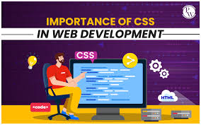
In the world of web development, CSS (Cascading Style Sheets) plays a crucial role in defining the visual presentation of a website. While HTML provides the structure and content, CSS brings it to life with style and layout. This blog post will explore essential CSS tips and tricks that every web developer should know to create visually appealing and responsive websites.
1. Understanding the Box Model
The box model is the foundation of CSS layout and design. It consists of four parts: content, padding, border, and margin. Understanding how these elements interact is crucial for creating precise and consistent layouts. Here’s a quick breakdown:
Content: The actual content of the box, where text and images appear.
Padding: The space between the content and the border. It adds extra space inside the box.
Border: The border surrounding the padding and content.
Margin: The space outside the border, creating distance between elements.
2. Flexbox: The Flexible Layout
Flexbox is a powerful layout module that allows for more efficient arrangement of items within a container. It’s particularly useful for creating responsive designs. Here are some key properties:
display: flex; — Enables flexbox on a container.
justify-content: — Aligns items horizontally (e.g., flex-start, center, space-between).
align-items: — Aligns items vertically (e.g., flex-start, center, stretch).
flex-direction: — Defines the direction of the main axis (e.g., row, column).
3. Grid Layout: Two-Dimensional Control
CSS Grid Layout is a two-dimensional layout system that provides greater control over both rows and columns. It’s perfect for creating complex layouts with ease. Key properties include:
display: grid; — Enables grid on a container.
grid-template-columns: — Defines the columns of the grid.
grid-template-rows: — Defines the rows of the grid.
grid-gap: — Specifies the gap between rows and columns.
4. Media Queries: Responsive Design
Media queries are essential for creating responsive designs that adapt to different screen sizes and devices. They allow you to apply CSS rules based on the device’s characteristics, such as width, height, and orientation. Here’s an example:
css
Copy code
@media (max-width: 768px) {
.container {
flex-direction: column;
}
}
5. Animations and Transitions
Adding animations and transitions can enhance the user experience by making interactions feel smoother and more engaging. Use the following properties:
transition: — Defines the transition between states (e.g., transition: all 0.3s ease;).
animation: — Defines keyframe animations (e.g., animation: slide-in 1s ease;).
6. CSS Variables: Reusable Values
CSS variables, also known as custom properties, allow you to store values that can be reused throughout your stylesheet. They are defined with a -- prefix and accessed using the var() function:
css
Copy code
:root {
--primary-color: #3498db;
}
button {
background-color: var(--primary-color);
}
Mastering CSS is essential for any web developer aiming to create modern, responsive, and visually appealing websites. By understanding and utilizing the box model, Flexbox, Grid Layout, media queries, animations, and CSS variables, you can significantly enhance your web development skills. Keep experimenting and stay updated with the latest CSS features to continue improving your craft.
Related Blogs

The Importance of Data Structures in Software Development
Read More...
Exploring Machine Learning Algorithms: A Beginner's Guide
Read More...
The Evolution of Programming Languages: From Assembly to Rust
Read More...
Understanding Big O Notation: A Guide for Developers
Read More...Subscribe for our Newsletter
Subscribe to elevate your software game! Stay updated on the latest trends, coding insights, and exclusive promotions with our newsletter.